Wednesday, June 27, 2012

DIY Abstract Art

As I am running out of major home renovation projects, I started to feel the need for some new personal enrichments, not that I haven't already been nurishing my minds with reading, creative writing (blogging), photography, violin, etc. Over the past year I've gradually picking up the painting again, from where I left five years ago. This past weekend I gave the minimal abstract art another try, and this is what I came up with.

I named it "Foggy Coast", 18x18, minimal abstract oil painting in pastel tone.

Close-up on the details.

And I think I found a perfect place for it -- a wall in my master bedroom.

We are hosting a BBQ party this weekend for some friends and their super adorable kids that I've been dying to see since last year, so it should be a lot of fun. Hope you all have a great Canada Day long weekend.


Friday, June 22, 2012

Vintage Finds

I recently came up with a new idea to display the vintage Franklin Mint Miniature Vases I've been collecting. I like the simplicity of Lucite display stand but don't like the dimension or the price tag of it. The Lucite stadium stand is usually intended for displaying small and precious items like jewelry, and they cost anywhere between $50 to $100 each. I came across this InterDesign Linus Spice Rack at Kitchen Stuf fPlus the other day, and thought it would be perfect as a display stand, and it worked!

It gives me ample shelf space so I can continue to add the miniature vases to my collection.

And the other day as I was browsing online (did I tell you I am a web shopaholic?) I thought this mid-century Pollo Vase designed by Tapio Wirkkala of Rosenthal Studio in Germany looked very familiar to me. I instantaneously rushed down to the basement to this, the identical one I picked up from a vintage shop (don't remember which one) a few months ago I am pretty sure for less than $10! The vase turns out to be a very rare collector piece now going anywhere from $200 to $1,250 in the open market! Oh my gosh!
I loved the organic shape and the form of the vase and that's why I bought it. Little did I know it was a super fantastic score.

So this is our basement built-in shelf based on Ikea Billy bookcase from December 2011. 

And this is the shelf now in June 2012. I've made a conscious decision not to rush to quickly fill it up, so the progress of accessorizing it has been slow.

Have a great weekend!


Wednesday, June 20, 2012

West Elm Vases and Rug

This past weekend I stopped by the West Elm @ Liberty Village and finally put the 15% coupon from the BlogPodium to use. I've always loved the store ambiance and the style varieties West Elm has to offer.

I came back home with two of these Shane Powers Opal Vases.

The opal vases look pretty nice in the monochromatic bedroom of mine, don't you think? The pair of vintage porcelain fawns are from my Mom. She bought them when she was a teenage, and they are now my precious.


I also picked up this Zig Zag Bath Mat in Slate as a kitchen floor mat right in front of the sink. It not only looks great but also pretty easy on the feet.
Have you gone decor shopping lately? Any interesting finds?


Tuesday, June 19, 2012

Love That House: 49 Pheasant Lane

If you've been following my blog for a while, you would know how much I love to fuse the new with the old in decorating. And that's why I love about this new "old house" at 49 Pheasant Lane, a $3.95 Million gem in the heart of Thorncrest Village.


Love the natural cedar plank ceiling and slate-color window and door frames -- they surely crank up the curb appeal of the house.

I would love to go home to this foyer! The lantern, the door, the wall panel and the wrought iron railings are examples of the old coexisting with the new in perfect harmony in one room.

Open to the above high ceiling adds drama and grandeur to the foyer.


The kitchen triangle seems a bit off, but with so much room to maneuver, one will never have to worry about bumping into anything in the way.

I am sure nobody would say no to a little desk nook in a massive kitchen like this!

I always love a wall-to-wall built-in unit, but I am not sure if I would go for one this scale in wood. The wood-tone unit seems to throw the room a bit off its balance -- not even the grey-leather sectional is a good match.

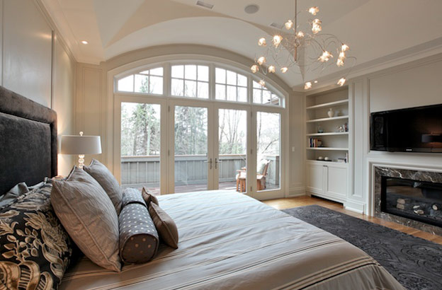
This master bedroom is so dreamy: walk-out to the deck, two built-in shelves flanking the fireplace, and white walls but not boring at all. The only thing I would change is probably the chandelier. I personally would prefer a more classic piece to anchor a giant bedroom like this, and also to soften the hard lines around the fireplace and the headboard.

Well, say no more, I love everything about this master bathroom. Funny the crystal chandelier over the tub is the same one I use in my dining room.


Guest Post: Playful Paisley Patterns

Today I am hosting a guest post from Arcadian Home, an onling one-stop shop for lighting, furnishing and decoration for your home. I have to admit when it comes to pattern, may it be for fabrics, wall coverings, or ceramics, etc., paisley never jumps out to me as my top choice. After all, in a decor world filled with countless selections of geometrical trellis/lattice patterns, who would have thought of a somewhat traditional pattern like paisley? That said, you will be pleasantly surprised by the different paisley patterns Arcadian Home Blog has come up with. As a matter of fact, paisley has come a long way from the grandma's couch fabric to a versatile pattern that can be easily played into from the typical shabby chic, feminine, to bold, playful, and even modern decor themes.

======================================

Hello there! I'm Mari, a writer for Arcadian Lighting, the fabulous online place to find various lighting fixtures from pendant lights to wall sconces . While you're there, be sure to take time to check out our great blog. I'm so excited to be here visiting with you at AM Dolce Vita. Today's guest post topic is playful paisley patterns which may be a tongue twister of sorts, but it's also some of my favorite textile and wallpaper designs. Paisley patterns have been around for a long time and show up in many cultures today. These pretty motifs are amazingly versatile, fitting beautifully into just about any style, from formal traditional to eclectic Bohemian. They have a special affinity for the beautiful global look that's getting so much attention right now. I hope you enjoy this look at paisley patterns in décor.
Paisley Patterns
Apartment Therapy chose this Horchow settee to be part of its "Loveseats & Settees: Small Space Solutions." How pretty it is in sunny yellow and white paisley.

Paisley Patterns
Versatile paisley goes retro with this orange wallpaper and modern chair. Is there any style that isn't enhanced by lovely paisley pattern?

Paisley Patterns
Global style spaces often include one or more paisley patterns. This one is a bit different than the expected riot of color with its muted tones, but it still maintains a global vibe.

Paisley Patterns

Lovely paisley prints are chosen for many decorative objects. Here sleek shades for mercury glass lamps are covered in pale paisley fabric.
Paisley Patterns
These beautiful mirror tiles and accessories by Candice Olson show how easily paisley patterns can slip into more contemporary style spaces.

Paisley Patterns
In this colorful bedroom, a pretty duvet cover in pink and green paisley print on a white background shows how well this appealing pattern plays with others.

Paisley Patterns
Filled with drama, this colorful living space features one wall of teal and gold wallpaper softly lit by track lights and tall lamps.

Paisley Patterns
Paisley moves outdoors with ease and grace in this appealing pink and green party space. Looks like someone is celebrating in style with the girls, doesn't it?

Tell us what you think below with your comments! And be sure to stop by Arcadian Lighting for your lighting and home decor needs!


Monday, June 18, 2012

Love That House: 50 Sullivan St

It wouldn't be difficult for me to stick to a series like "Love that House" considering the amount of time and efforts I spent researching for investment properties. Unless otherwise specified, I have no affiliation with the owners or agents of these properties what-so-ever. I am just an ordinary real estate investor who also happens to have an appreciation for tasteful renovations.

For an affordable $1.6M, you can own this top-to-bottom-newly-renovated 3700 sq ft detached in the hip Queen West neighbourhood, near Grange Park. The "50 Sullivan St" looks like a professional but pretty decent flip.

The modern yet minimal glass stair railings make the hallway feel bright and spacious. The color schedule is so consistent throughout the house that it offers no surprises. It signals all the rooms in the house were probably renovated at the same time in one shot, or a flip.

The modern and minimal decor style carries through the main floor living area.

Love, love this kitchen! I didn't know I could love a super modern kitchen this much but I do! It looks fresh, clean and offers ample seating.

I would probably lose the funky (trendy) upper glass cabinet doors, and use the same white cabinetry for a better flow.

A good-sized master bedroom finally with a punch of color.
This ought to be the master ensuite. The similar tile pattern and tile-vanity-combination seems to carry through all the bathrooms in the house.


Saturday, June 16, 2012

Apple of My Eye: Coffee Table Books

I came across the "Modern Art" by Taschen (2 volumes) the other day while I was browsing online for Father's Day presents. I couldn't resist the temptation but to pick up a copy for myself, and was pleasantly surprised by the breadth of art styles the books cover -- from Impressionism to Minimalism to Post-Modernism. Under each category artists of significance were listed and their signature works shown in large color prints.


They also make great coffee table books, don't you think?


Thursday, June 14, 2012

Bathroom Wall Tile Patterns

It was perfect timing that Sarah 101's "Refreshed Master Bath" episode was aired this past Tuesday. Just when I was about to bang my head against the wall while overwhelmed with numerous tile pattern options for my upcoming bath reno (yet another one), Sarah came to rescue. I totally dig how she used the mosaic tile on an accent wall.

Before I get to the pattern design I borrowed from Sarah, I will first show you some "skeleton" in my closet...isn't this baby ugly! I can't believe I even paid extra for those tiles three years ago!

Enter the grid...are you dizzy yet?

Now come the options for the tile patterns. It is for the middle section of the C-shape tub enclosure wall. The two wing walls will continue with the same white subway tiles.

Option 1: Waterfall accent: marble mosaics in the middle defined by two Carrara rails. The rest of the wall in 6x12 or 8x16 white subway tiles.

Option 2: Picture frame accent: marble mosaics framed by Carrara rails, surrounded by 6x12 or 8x16 white subway tiles.


Option 3: Wide stripes: I've sort of already ruled this out but I will throw it in the mix anyway. The wide stripes will be running across the three sections of the C-shape enclosure.  

So how would you rank the above three options? Any other suggestions?


Related Posts Plugin for WordPress, Blogger...